Introduction
It’s quite common for a person in their old age to take multiple medications for multiple times during a day. They often need to be reminded for this action. However they aren’t tech-savvy and very often have bad eyesight. None of the medication management apps currently on the market focuses on these problems. So I decided to create a way for senior citizens to easily add and edit reminders so that they can take their medications on time.
The final products are an app that focuses on helping senior users take their medication on time, and its responsive companion web site.
The tools used are Adobe Photoshop, Illustrator, and XD.
User Research
I studied different types of medication management apps on the market and used the result to develop interview questions. Then interviews are conducted and usage of these apps were observed. Most participants report difficulties because they are all in their old ages and have limited knowledge on how to use tech. They are also constrained by poor eyesight and limited fine motor movement.
Persona
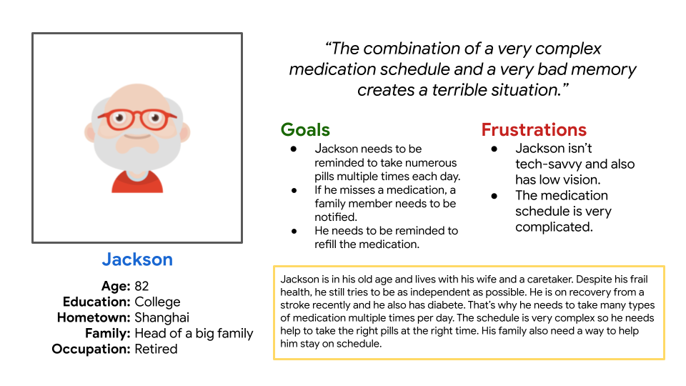
A personas was created as the result of the research:
Persona: Jackson
Problem statement:
Jackson is a senior patient who needs a way to remind him to take his medicines because he needs to take numerous pills multiple times per day.
User Journey Map
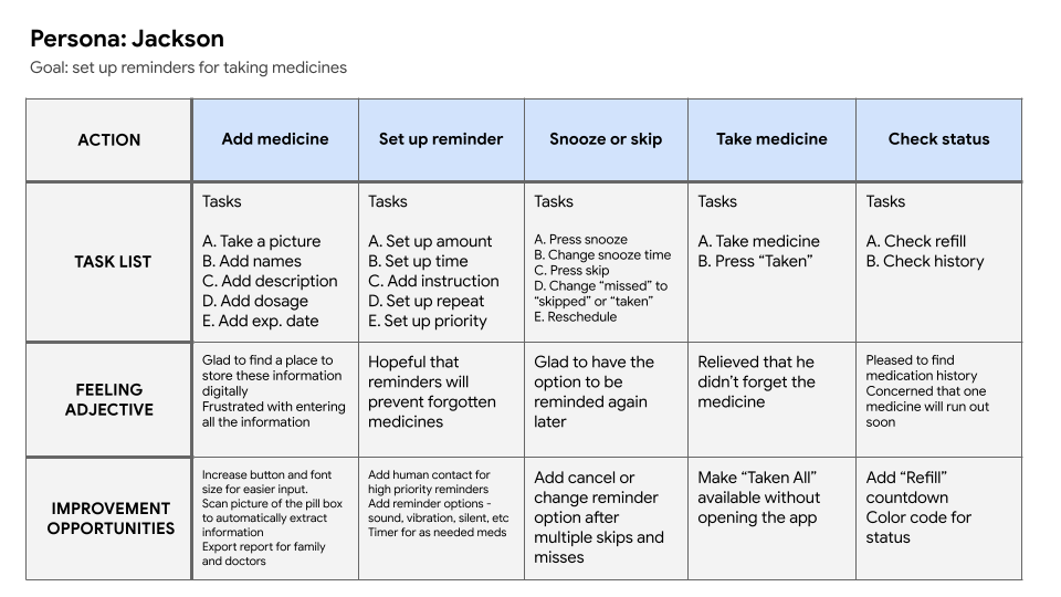
The user journey map is based on the persona I created and it helps to put me in the user’s shoes to better understand their needs.
Wireframing and Prototyping
Paper wireframes were created to come up with ideas that address the user’s pain points. My focus was to make the app very easy to use and limit the input action to tapping only as much as I can.

After ideating and drafting paper wireframes, digital wireframes were created. These designs focus on how to make the app simple to use. Eventually I have decided to limit the functions offered and focus only on managing the reminders.
To prepare for usability testing, I created a low-fidelity prototype that connected the user flow of adding medication and setting up reminders.
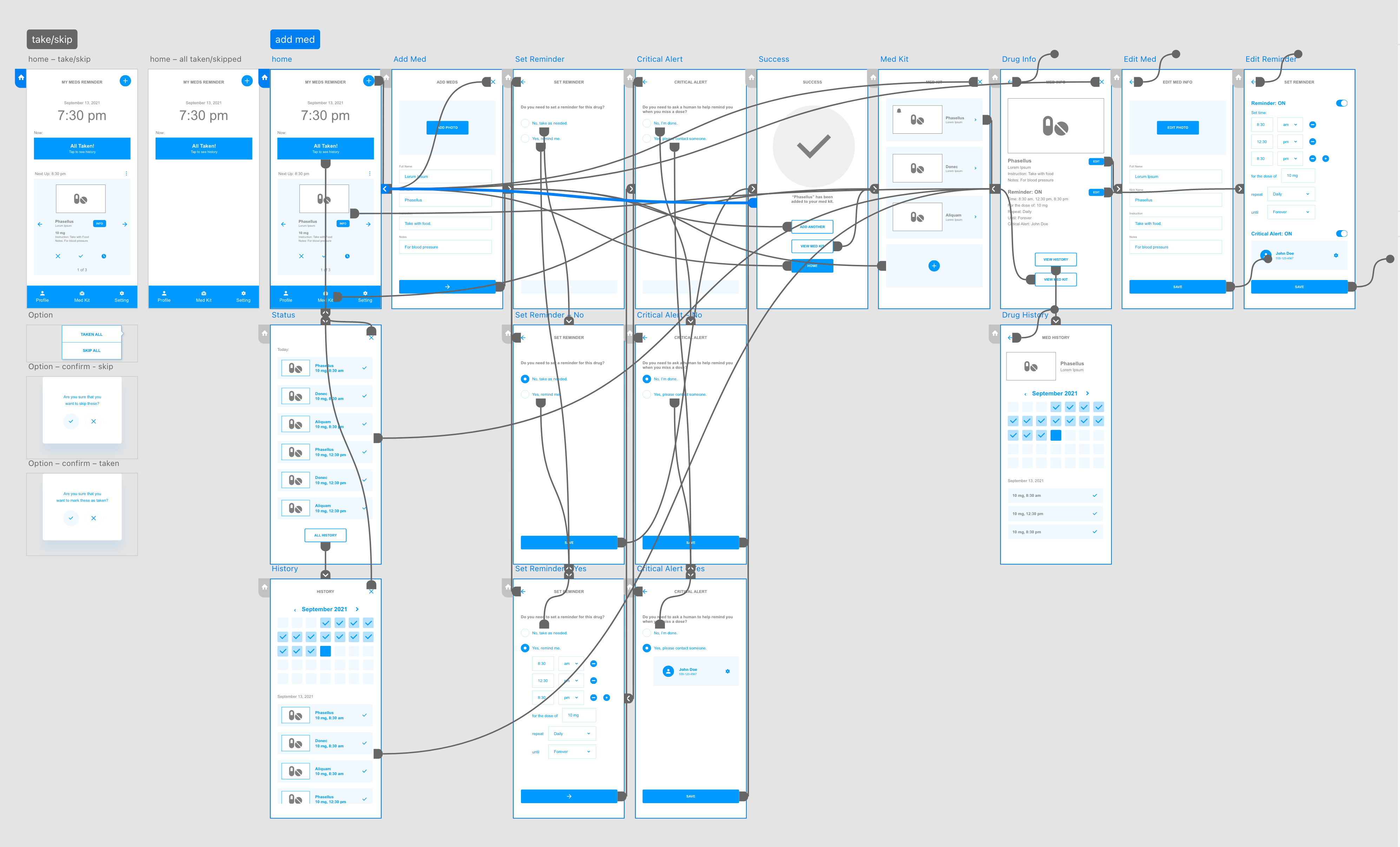
Initial user test was conducted and some findings are listed below:
1
Senior users need the easiest method to add the medicines.2
Senior users prefer very big text, simple UI, and clear design.3
Senior users often need guidance for every step of the user flow.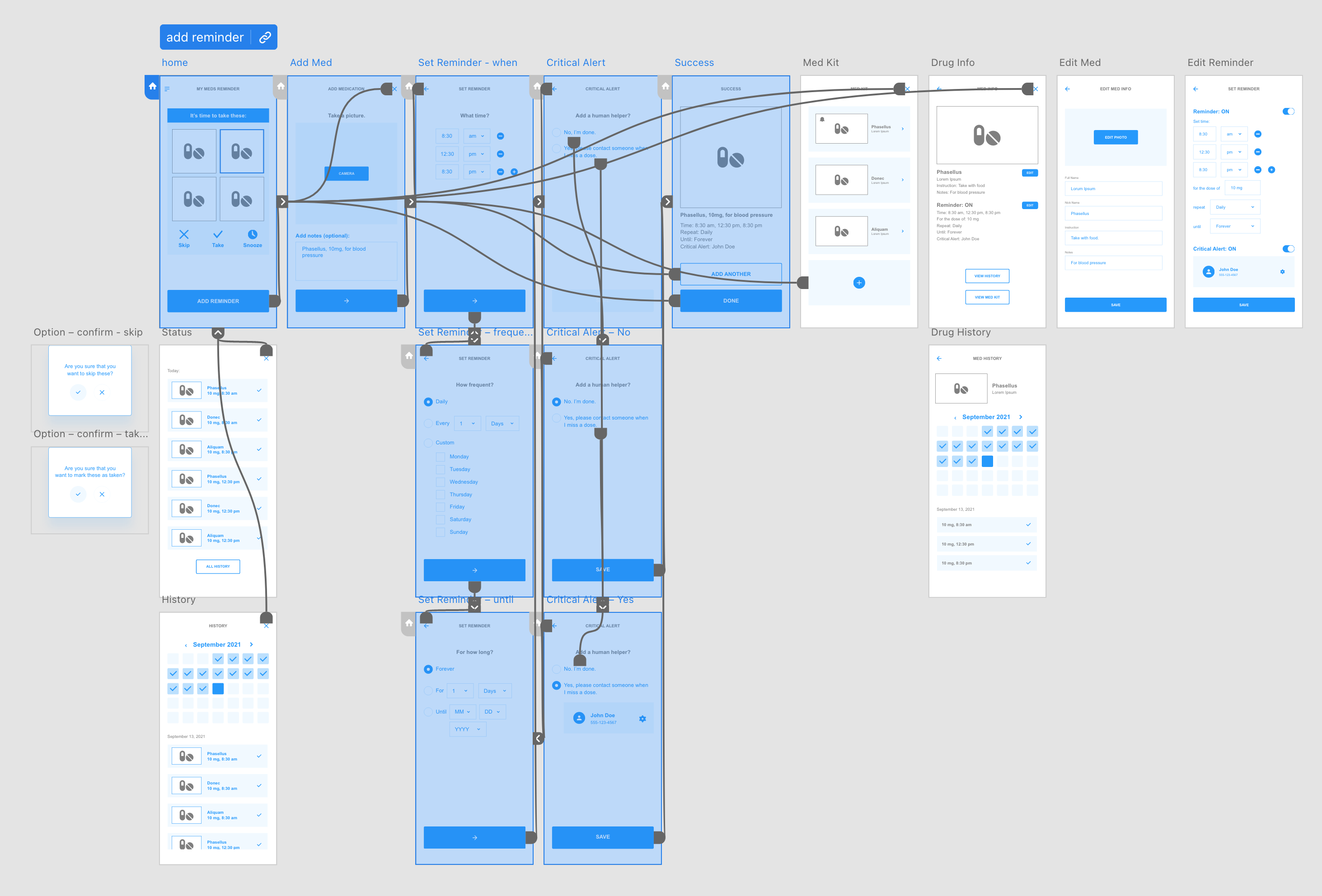
The digital prototype then was updated according to these findings. View the updated low-fi prototype on Adobe XD.
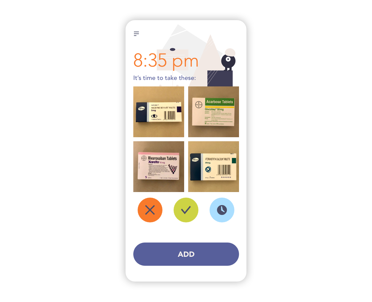
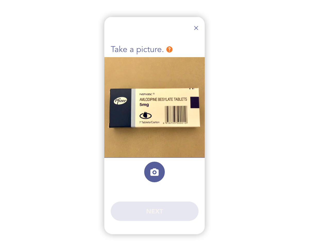
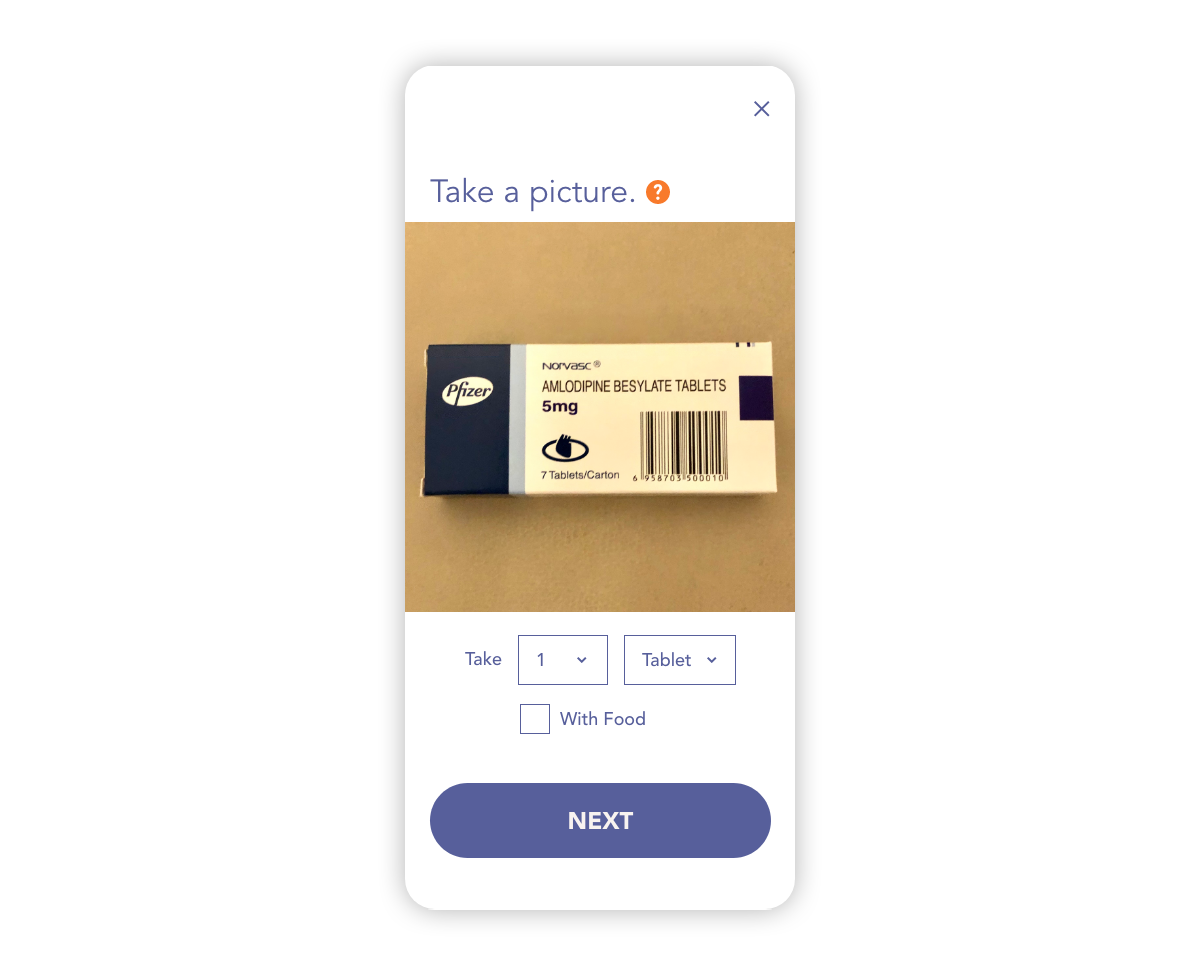
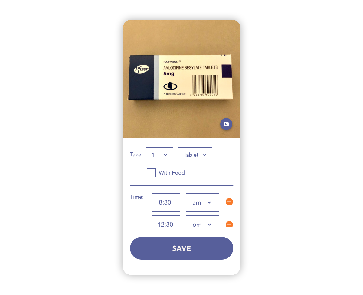
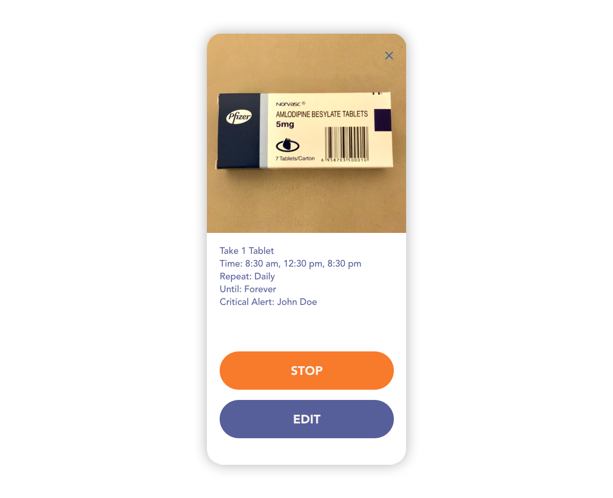
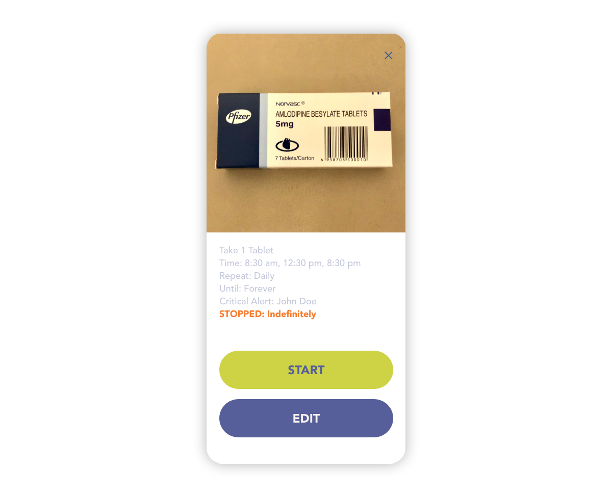
Compared to the other meds reminder apps on the market, one major difference of my design is that the input of the medication info is done through the camera. When the reminder is set off, the user can also enlarge the picture to see better. It's also more versatile since the user can take a picture of anything that can serve as a reminder. For example, a hand-written note. Through the entire user flow, I've tried to limit the user interaction to taps as much as possible, as that is the easier motion for a senior person to manage.
High-fidelity Mockups
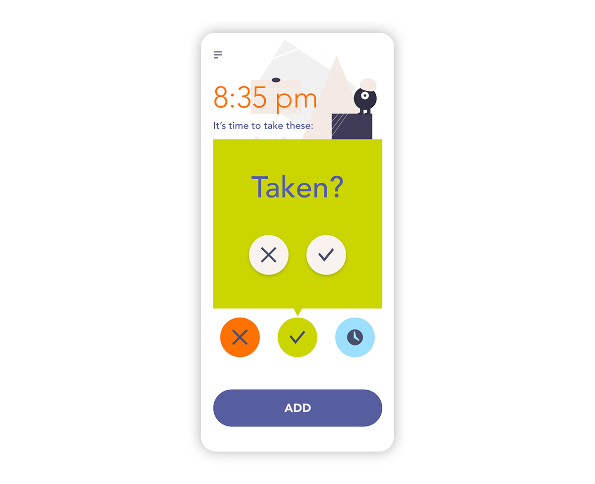
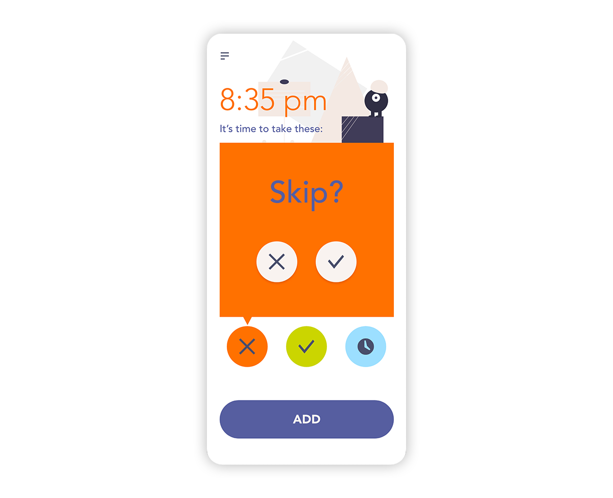
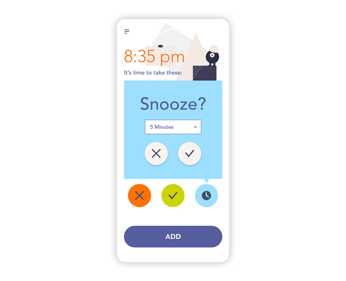
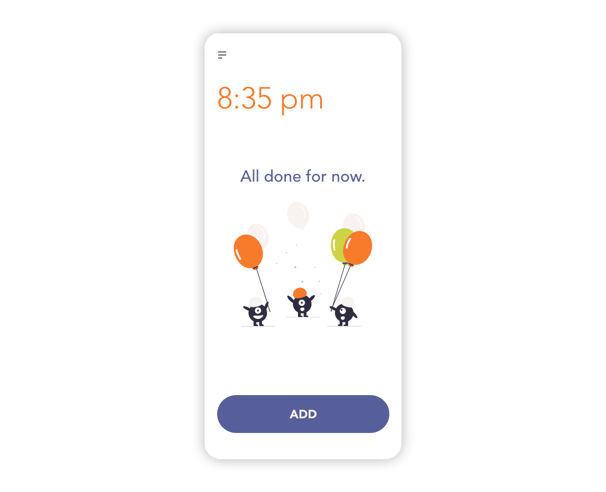
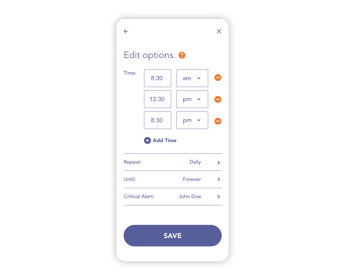
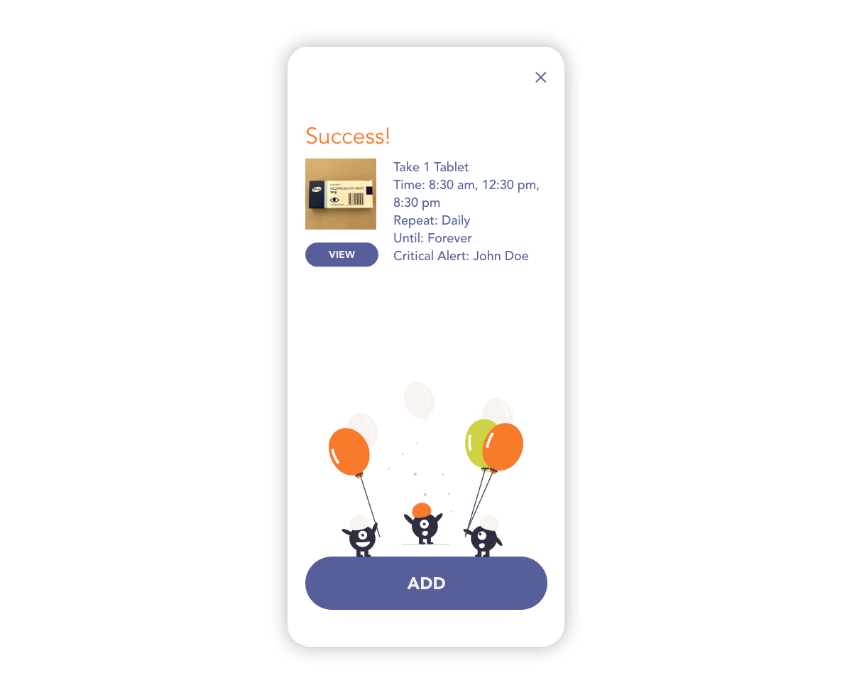
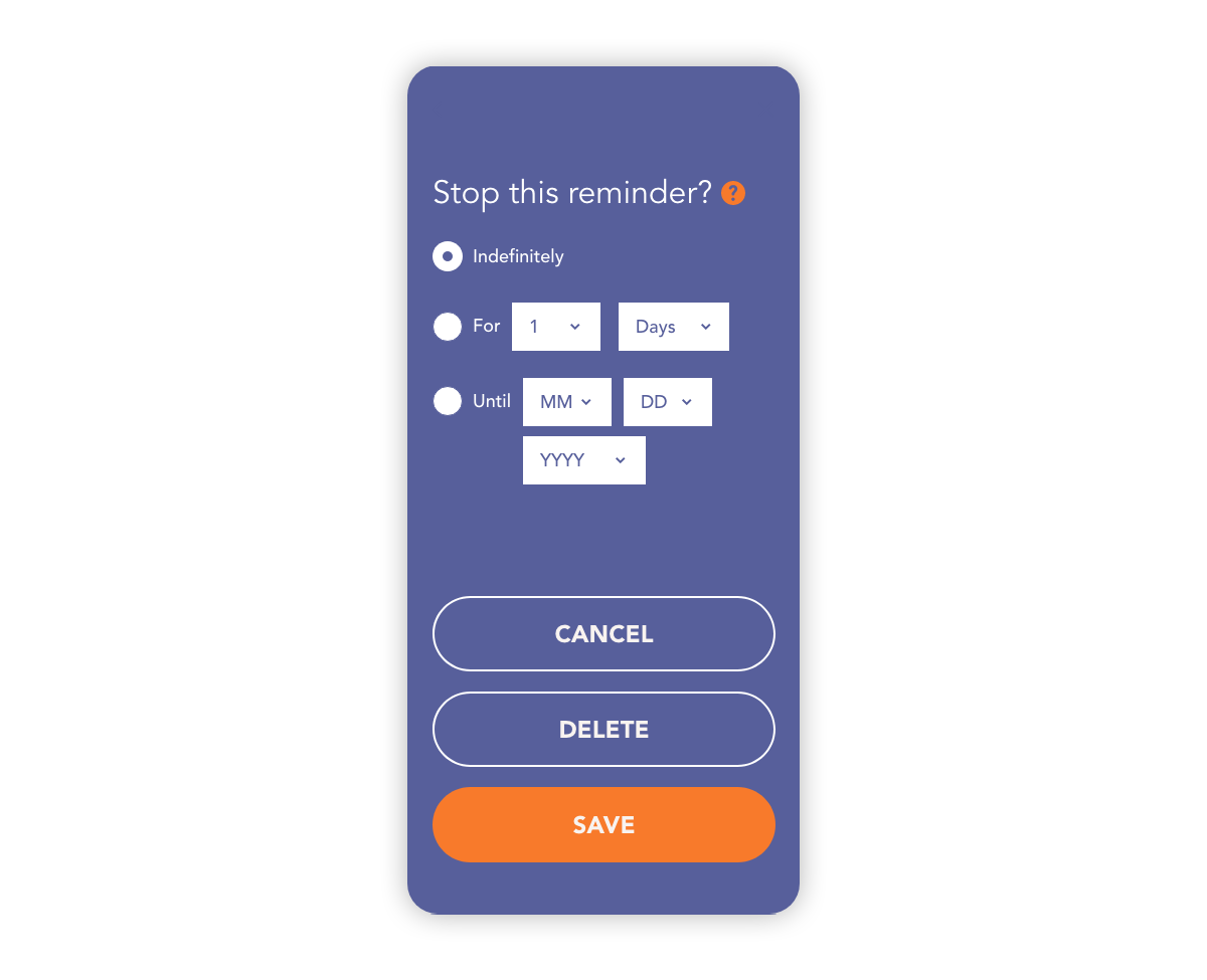
Based on the insights from the usability studies, options and drop down menus are provided to make the process easier. Additionally, an option to stop the reminder was added, and the number of buttons on the screen was reduced to avoid confusion. For the visual styles, I used bright and bold colors to make the response options clear and easy to remember.
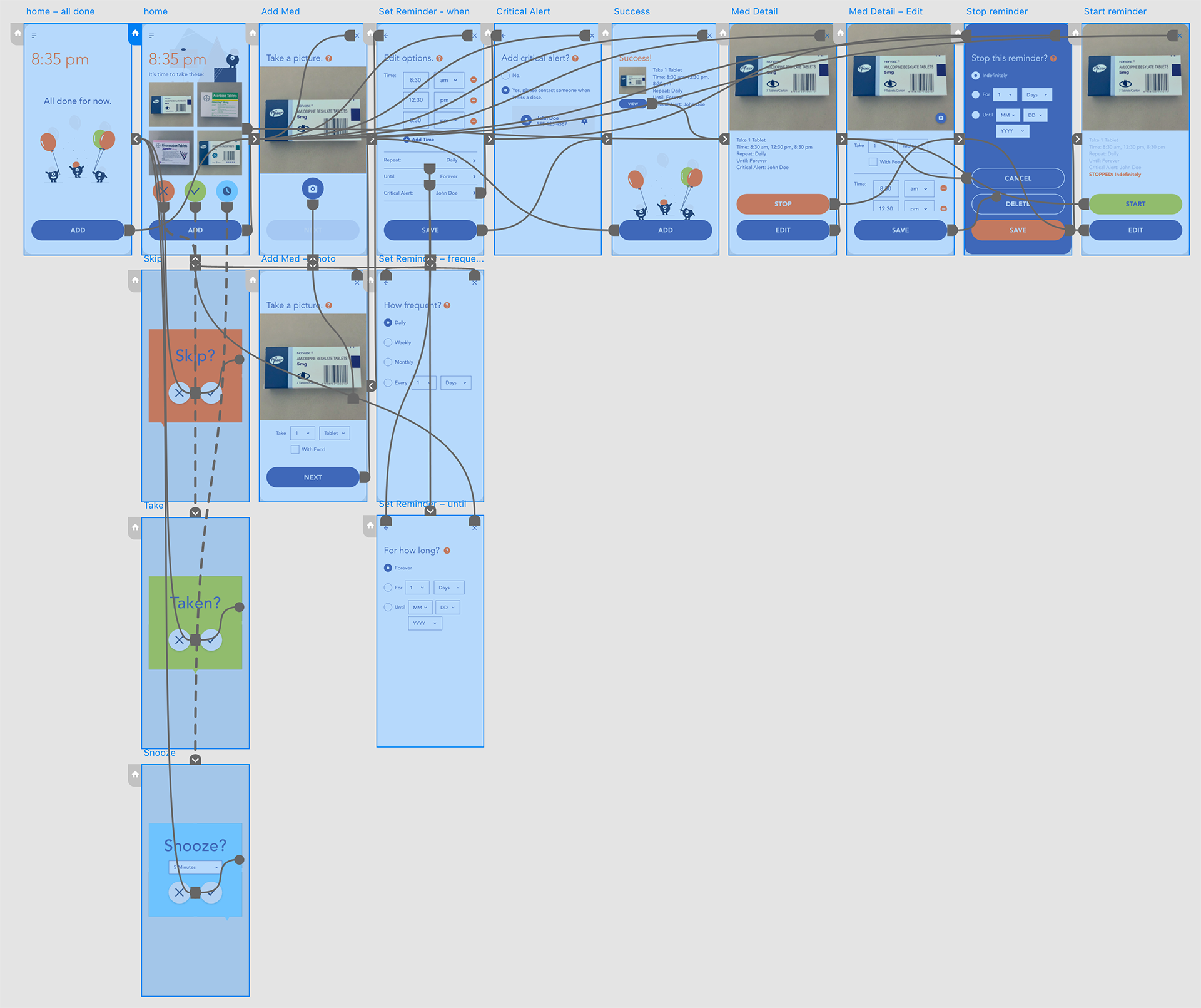
The high-fidelity prototype demonstrates the user flow of adding a medicine and setting up reminders. View the prototype on Adobe XD.
Companion Website
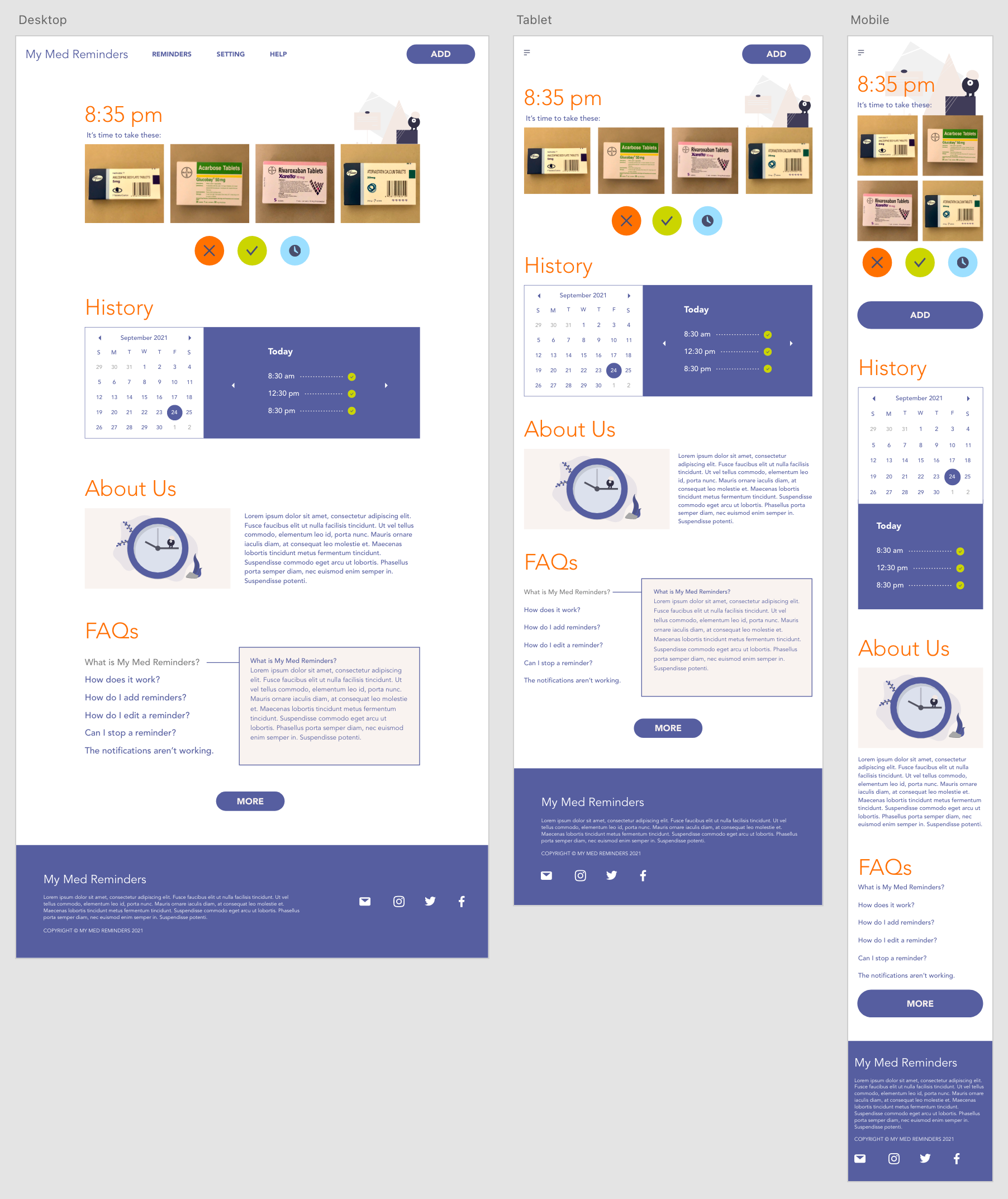
The companion site displays more elements on each screen than the app but keeps the core function the same and at the top.
Takeaways
When a person gets old, sometimes it’s very difficult for them to use the standard products available on the market. I hope this app will provide some help to a group of people whose needs are often neglected in UX/UI design.
The problem I tried to solve requires lots of thoughts and effort. The solution I came up with may not be perfect but the process really put me in other people’s shoes.
Thank you!
If you're interested in this project and want to hear more, please feel free to contact me.
