Introduction
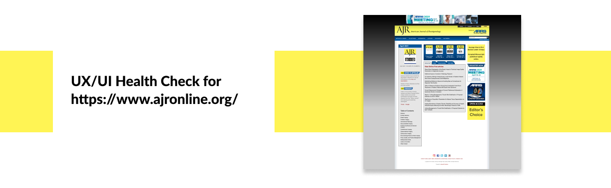
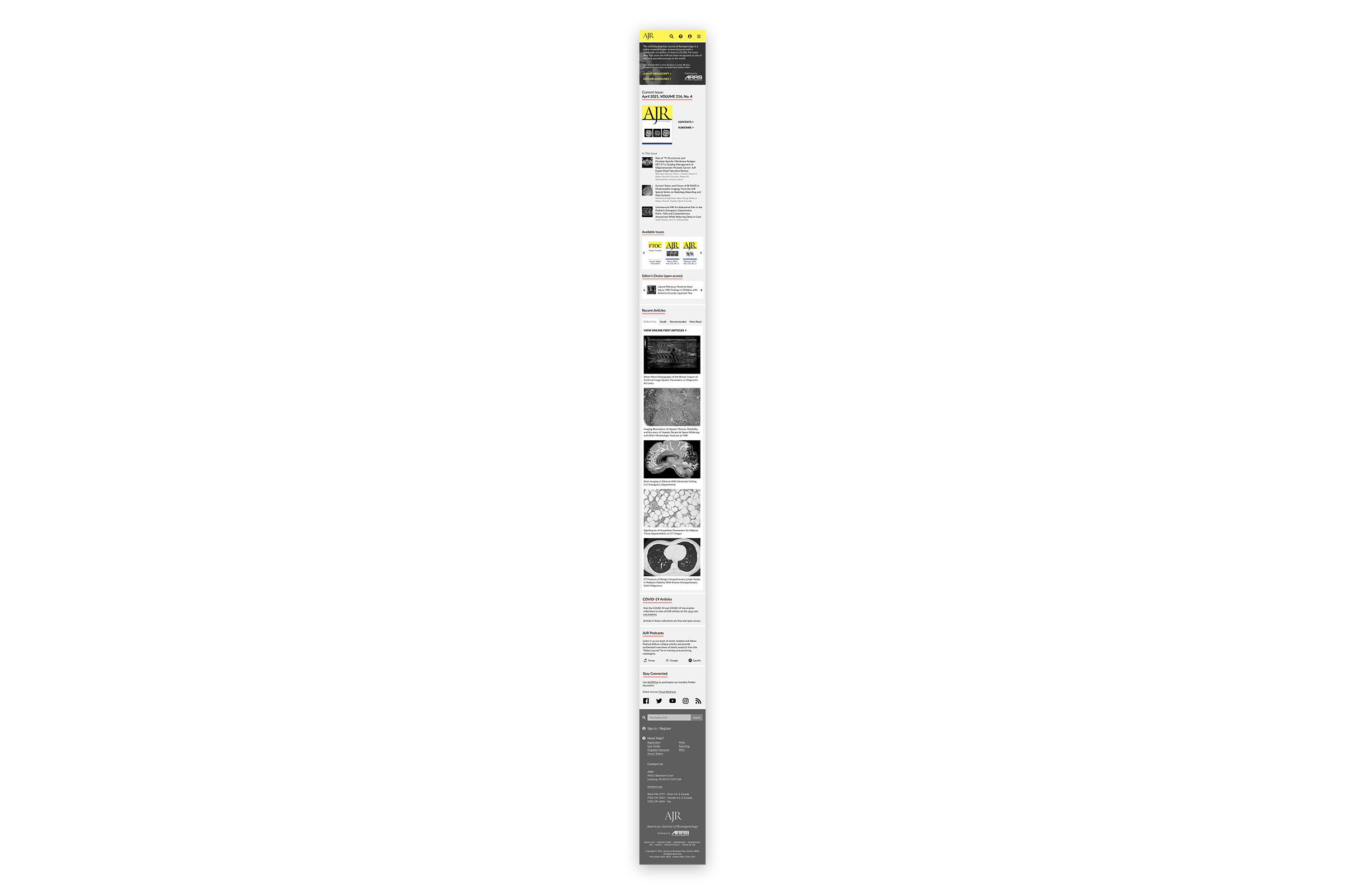
This is a two-part project. The first part is to analyze the landing page design of AJR's current web site and identify the UX/UI problems. The second part is to redesign the landing page using Figma. The final products are a detailed report and a set of redesigned layouts.
Part I: Issues and Solutions
A number of issues were found during the analysis. Here is the quick summary:
- Non-responsive template
- Uncomfortble colors and inconsistent designs of UI elements
- Out-of-place ad and lack of space for announcements
- Poorly organized navigation
- Presentation of the current journal issue is unattractive
- Tabbed area for articles is difficult to read
- Inconsistent graphic elements in the side bar
- Footer provides little useful information
These figures were created to show some of the supporting evidences.
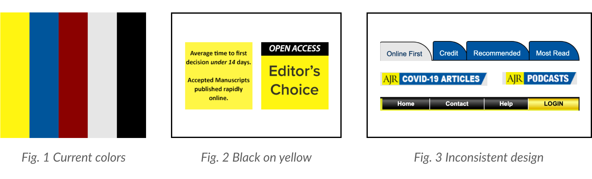
Among the above issues, the most severe ones are about the responsiveness, the visual styles, and the navigation.
Part II: Redesign
Based on these findings, the proposed solutions are:
- Re-design the page in a responsive web template.
- Re-design the color palette to create a more harmonious look. Make the containers of contents lool even. Choose modern fonts and make the size responsive to the viewport size. Use consistent styles of the UI elements.
- Give the event more real estate on the page. Remove the banner from the header and put it into the hero area where important announcements can be featured.
- Re-organize the nav items and keep them in the same area. Rename “Information” to “About AJR” or “About us”. “Contact” can move under this item. Rename “Authors” to “For Authors”, and “Reviewers” to “For Reviewers”. Remove “Multimedia” and feature the links elsewhere on the page (footer, sidebar). “Search”, “Help”, and “Login” can be represented with icons. Enlarge the search box and provide hints inside the input field.
- Move “COVID-19” and “Podcasts” to the side bar. Replace the table of contents with figures and article titles from the current issue.
- Reduce the number of articles listed. But provide more information, such as research topics, collections, authors, figures, etc, for each article. For each tab, provide a heading.
- Reduce the number of articles listed. But provide more information, such as research topics, collections, authors, figures, etc, for each article. For each tab, provide a heading.
- Redesign the footer, add additional elements like logo, contact, search, login, etc.
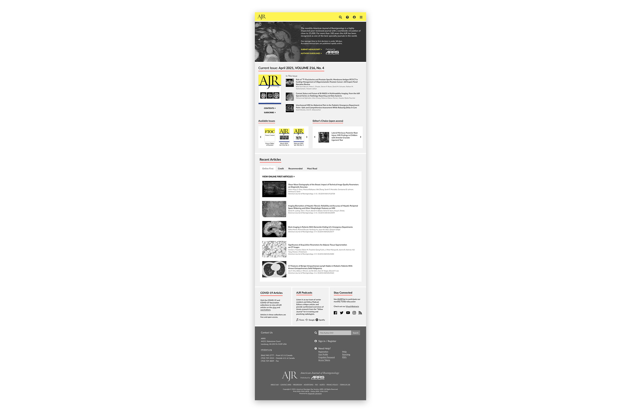
Redesigned landing page layouts can be viewed on Figma.
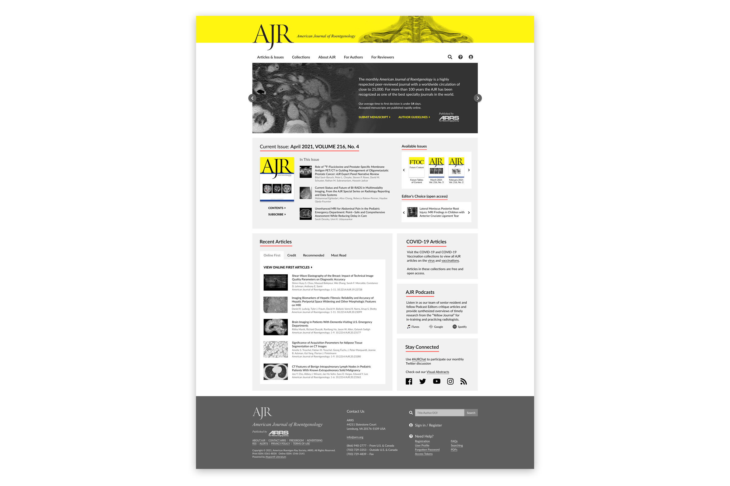
Landing Page Design - Desktop View
Landing Page Design - Tablet View
Landing Page Design - Phone View